Sprint four goals for beta involved:
- making the mobile menu more accessible by further iteration
- testing new content in the learning areas
# Design artefacts
# Mobile navigation
# Design decisions
We observed that users are freely moving between different sections of our service using breadcrumbs and device back button on mobile. In order to enhance the user experience, we trialled various iterations of the navigation by bringing it below the header, adding sticky functionality, but users did not use the navigation to get from one page to an other.
We wanted to test the navigation really well to understand whether any modifications are necessary to the design system header with navigation. Therefore we made the following modifications to the navigation to test in sprint four:
-
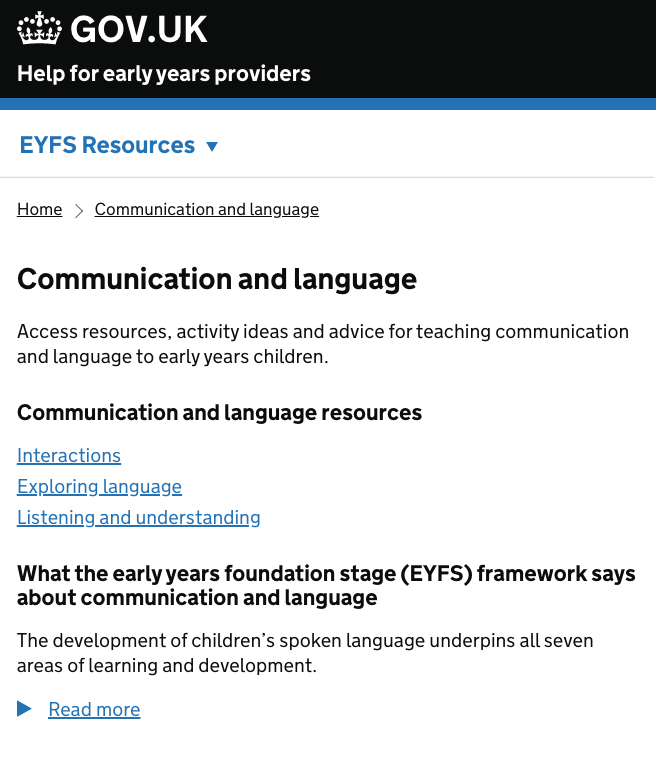
removed navigation from the homepage and only displayed navigation when users land on one of the learning areas – based on the assumption that navigation should corelate sidebar on desktop
-
moved the phase banner to the bottom of the page, just above the footer (from design system backlog, it was evident that the feedback link is not working well when placed in the beta banner)
-
renamed the menu to something that makes sense to the user – ‘EYFS resources’
# User insights
-
Positive end to end testing of the service. Users could navigate between different areas of the site and displayed a clear understanding of the site structure
-
All users started at the areas of learning section, initially clicking on Communication & language - either because they are working through it systematically, because their early focus is on the prime areas or because they have heard it one of the main areas changed under the reforms
-
The overall feel of the content continued to test well. The length of each section is not causing any problems and the structure resonates with users. Areas that particularly stood out were: anything with age-related expectations attached; activity ideas and how each area of learning links with other areas of learning (but only when there were hyperlinks to those other areas)
-
The design changes on mobile navigation did not make a functional impact to the user’s journey within the service. Users continued to use browser back button and breadcrumbs to navigate on mobile screens.