Sprint one goals for beta involved testing the html prototype, specifically around:
- usability of the service
- start page
- landing page or hub page with 7 prime areas and other resource links
- resource pages
- desktop and mobile navigation from the resource page
# Design artefacts
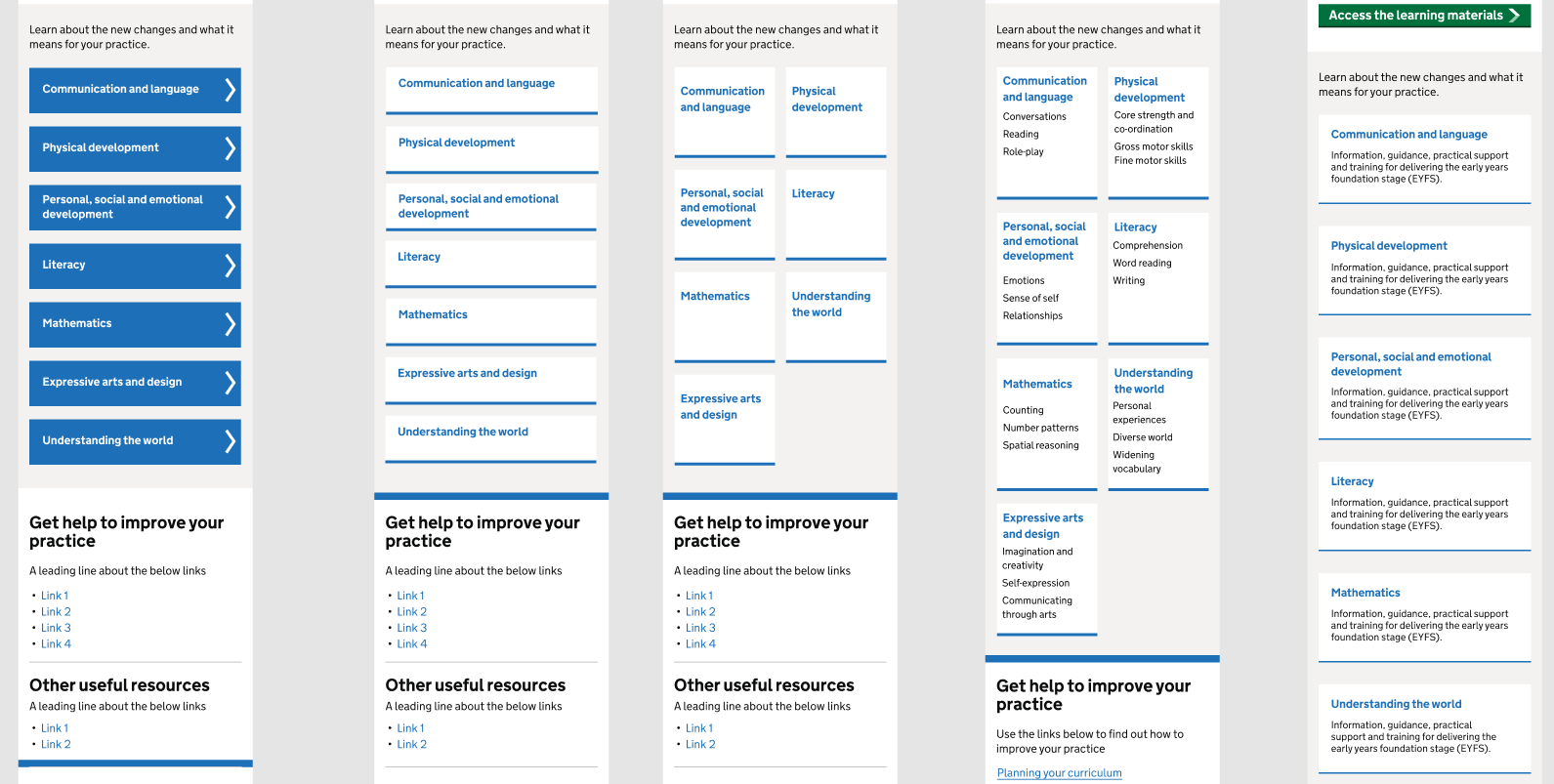
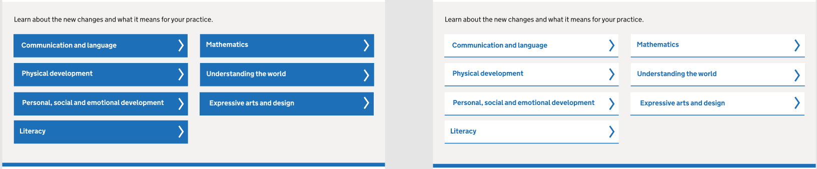
# Card design variations to highlight prime areas
# Hypothesis to validate
We believe that highlighting the main topic areas within the EYFS framework will help users to find the relevant topic they are looking for.
# Design decisions
We tried various versions of card designs taking inspirations from ‘Get help with remote education’ service and GDS design system backlog where other designers shared their experiences with this component. We also looked at NHS design system for a variation of card design that could accommodate our needs.
During the very earl stages, our card designs needed to accommodate supporting text for each prime topic. We learned at a later stage that the supporting text will be repeated on all the cards, so we decided to drop the supporting text to have just link headings. The headings needed to be prominent and indicate the user that the link would take them to a page. NHS website has a good component that addresses this, so we copied the code for that component to tweak our card design. We reused the chevron icon from one of the service that uses GDS task list pattern.
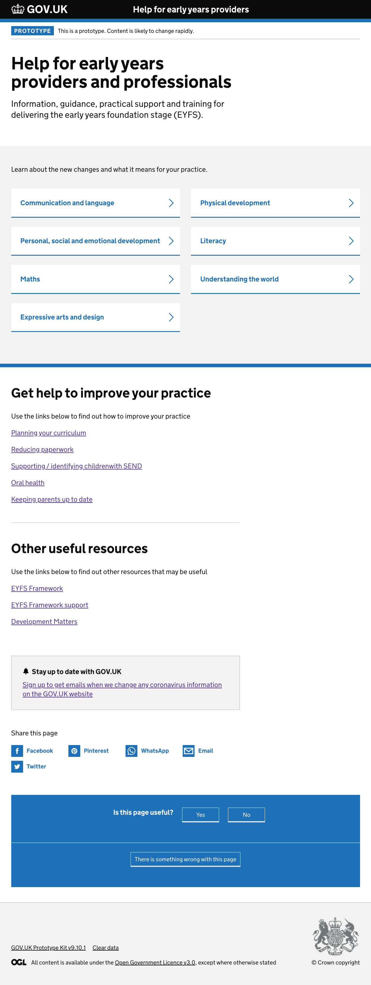
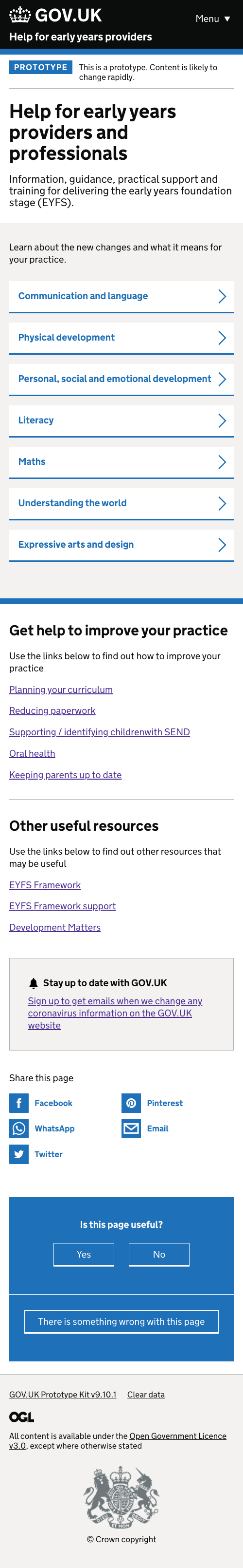
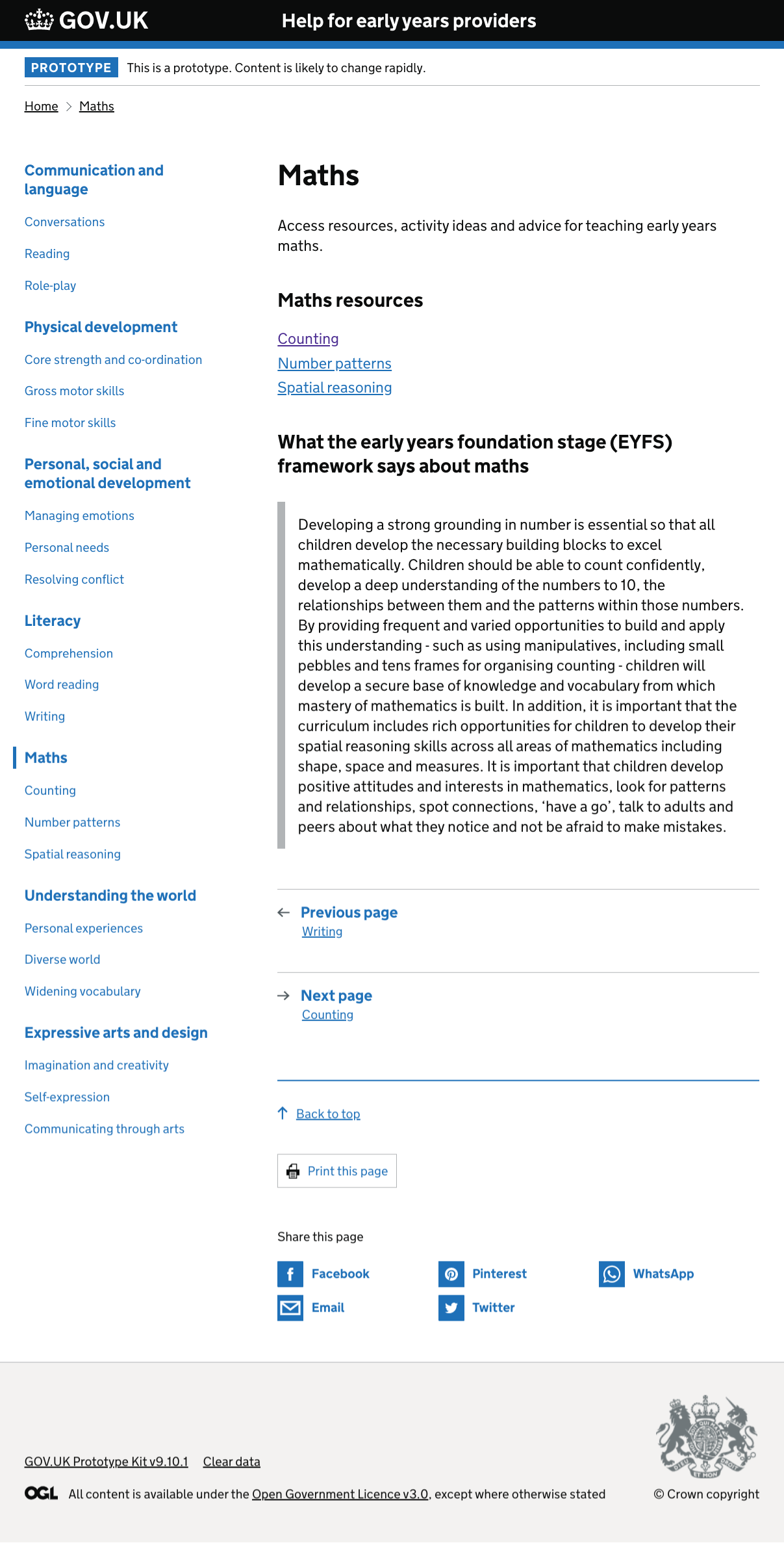
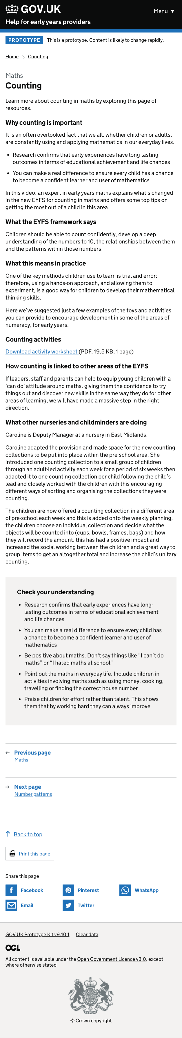
# Resource pages
# Hypothesis to validate
We believe that users want to reference different topics in a non linear fashion by dipping in and out of different sub categories.
# Design decisions
The current design for the resource page is taken from GDS design system website. The rationale behind trialing this design were:
- users will be able to see all the topics and sub-topics through a sidebar navigation so they don’t have to go back and forth to the home page
- mobile navigation of this pattern is developed with accessibility in mind and is progressively enhanced through javascript
- it is thoroughly researched by GDS and the code is available for easy prototyping
We have also opted the use of additional publication components such as back to top, print this page, social links, pagination from GOV.UK component guide for consistency.
# User insights
- users found it helpful to have all the information they need in one single place – including policy documents, framework support content and development matters
- navigation on desktop and mobile worked really well – users did not get stuck from completing the tasks set out to them – observed how they navigate from one topic to an other sub-topic in a different section
- mobile users relied on breadcrumbs to navigate around different topic areas missing the menu button at the top to navigate other toipics
- navigation on mobile needs rethinking – users did not find the menu button in the header until prompted
- navigation on mobile needs rethinking – users did not find the menu button in the header until prompted
- sidebar navigation was used sparingly by the user – main navigational element was breadcrumbs and it worked really well
- order of information for landing page needs adjusting so users won’t overlook ‘Get help to improve your practice’ section
- users expressed their interest for splitting the area of learning, sub-categories by age