Sprint three goals for beta involved testing the html prototype, specifically around:
- making the mobile menu more accessible
- testing additional content and its usability
# Design artefacts
# Mobile navigation
# Design decisions
We have tried various design iterations before testing this final version. Initial hypothesis was that a sticky menu that scrolls with the page would make the menu more visible for the users.
GDS tried this method and documented their design decisions. Using the findings from this blog post, we set out to find a fix for the sticky menu. But it proved to be really tricky and ended up having a messy javascript file.
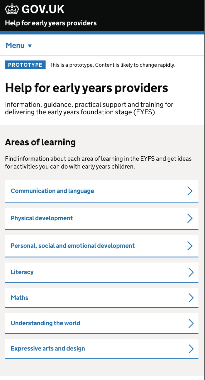
# Card design – 7 areas of learning
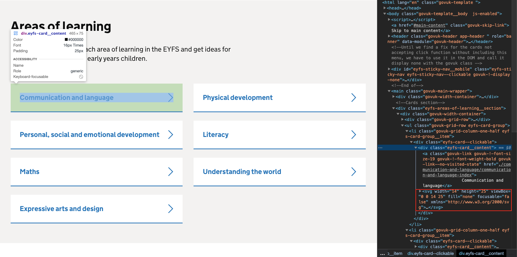
# Design decisions
Initial design was taken from NHS card component. Having this code readily available meant that we didn’t have to build it from scratch. I have noticed few glitches with this code and decided to fix it.
- Chevron icon as an svg background image meant that we had to use a separate file on hover
- Chevron icon also would disappear on active state in some instances
- Using the svg icon as a background image meant that we had to tweak extra lines of code to achieve even padding around the card design
- Therefore we moved the svg icon into the html and placed it below the anchor tag and used flex to align it
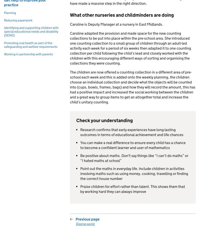
# Check your understanding design
# User insights
-
The new content has lost some of its potential impact by only meeting the needs of users who prefer to absorb text-based information. The lack of visual cues and the sparing use of stand-out features such as bullets and boxes means that some users are less likely to engage with the text
-
There should be further testing of the text used in the original ‘Check your understanding box’. The text tests extremely well and greater insight into the reasons for this would allow for potential replication
-
The menu function on mobile is not visible. Consideration should be given to placing it closer to the actual content to overcome banner blindness or alternative navigation options should be pursued