Sprint two goals for beta involved testing the html prototype, specifically around:
- usability of start page
- usability of navigation on mobile and desktop
- remove any unwanted distractions from the design of start page and hub page
# Design artefacts
# Start page
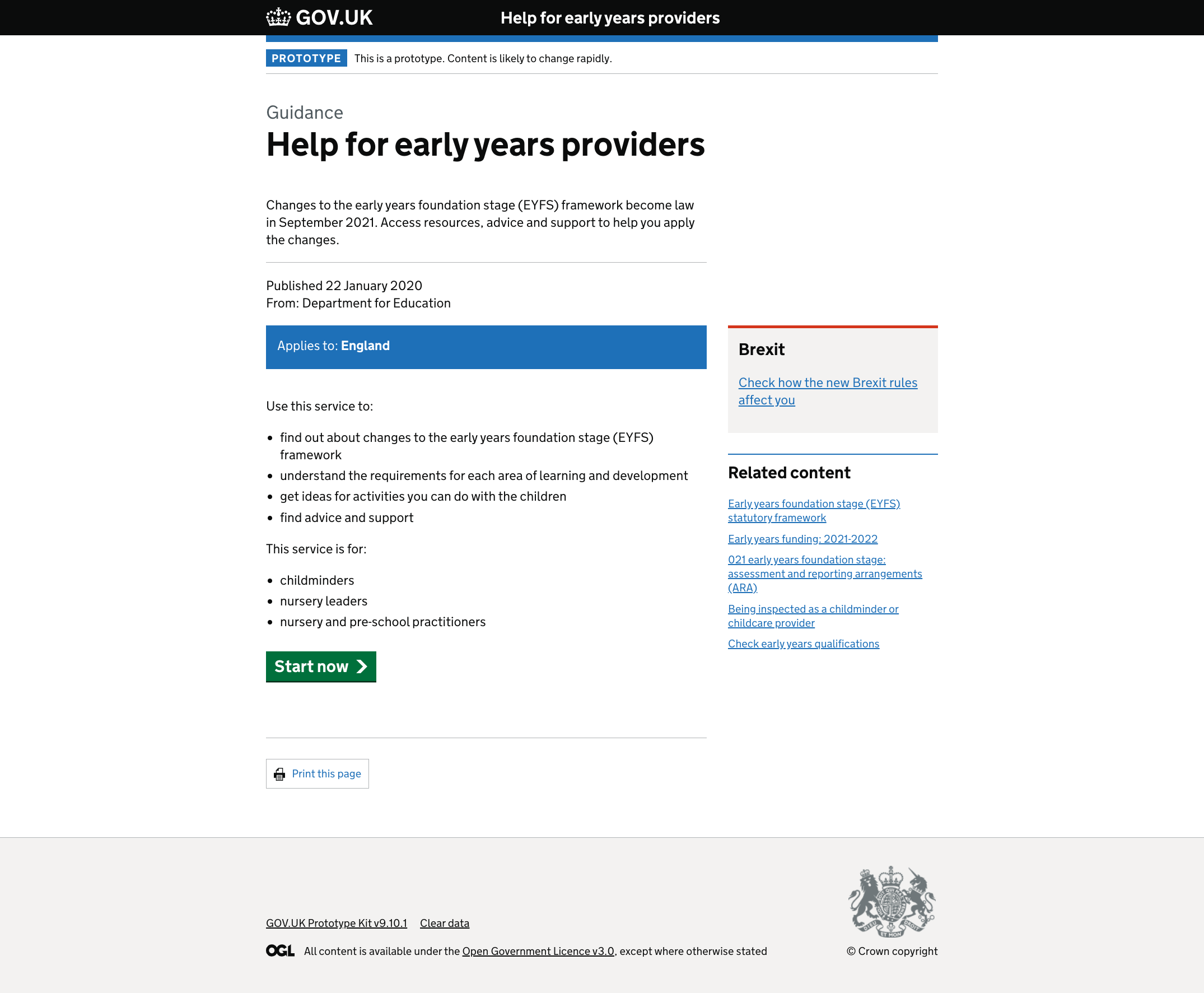
# Design decisions
What you need to know and Explore the topic sections were distracting and unnecessary. These have been removed.
# Hub page
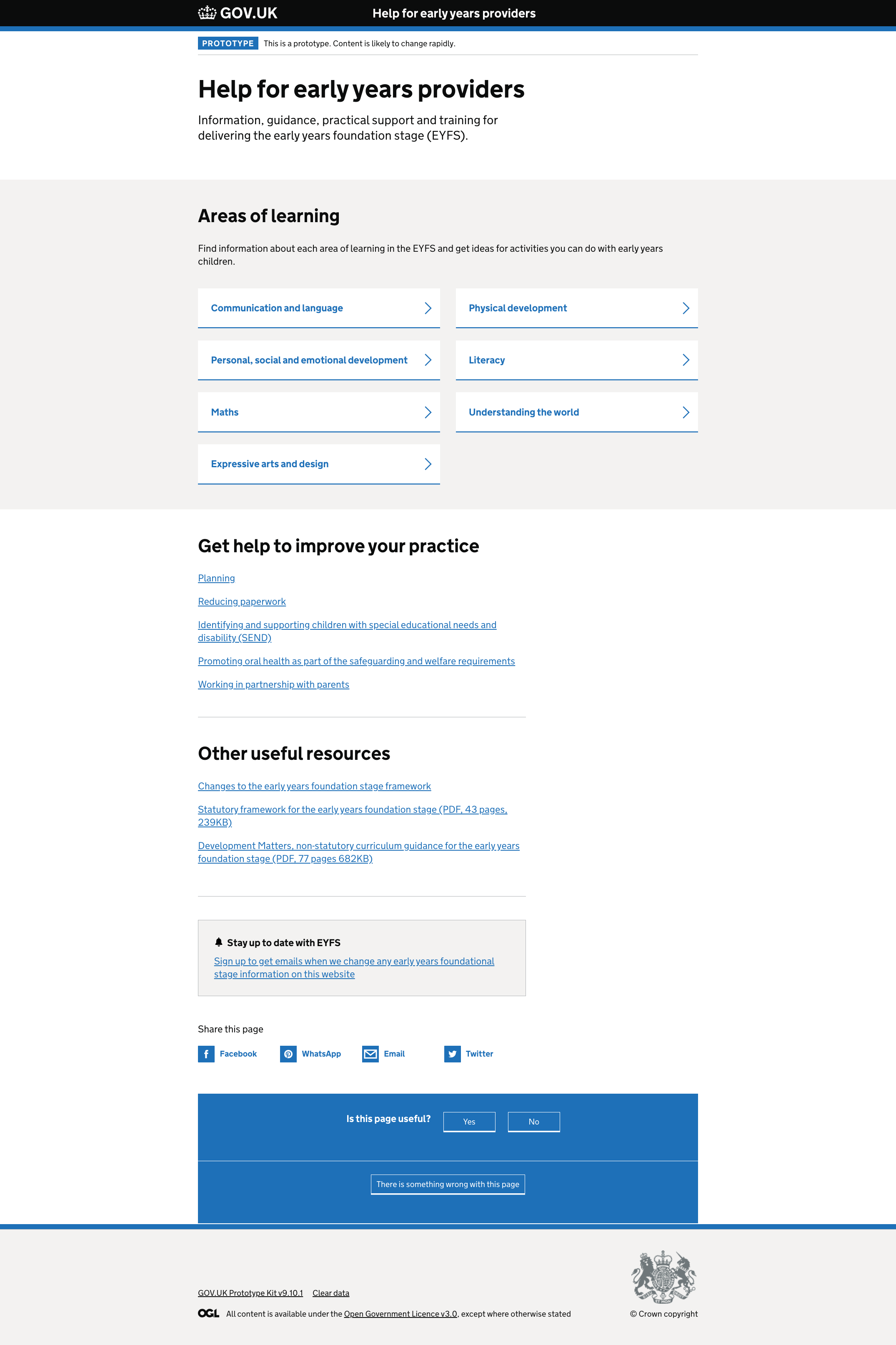
# Design decisions
-
we added a heading to the grey box to make it clear and changed the line of text below to make it more descriptive
-
removed the thick blue line underneath the areas of learning as it was acting as a block to users reading further down the page
-
we removed the extra line of text under the Get help to improve… and Other useful resources as it wasn’t adding anything useful for users
# Mobile navigation
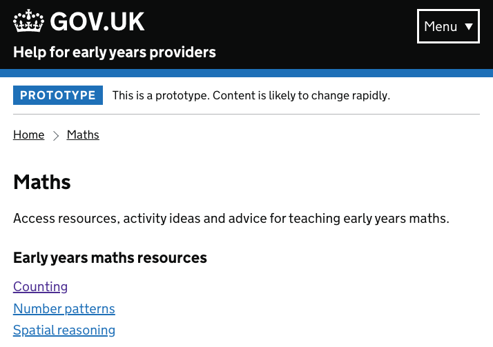
# Design decisions
Users did not see the menu button to open the navigation, so we tested a version which made it more prominent.
# Resource page
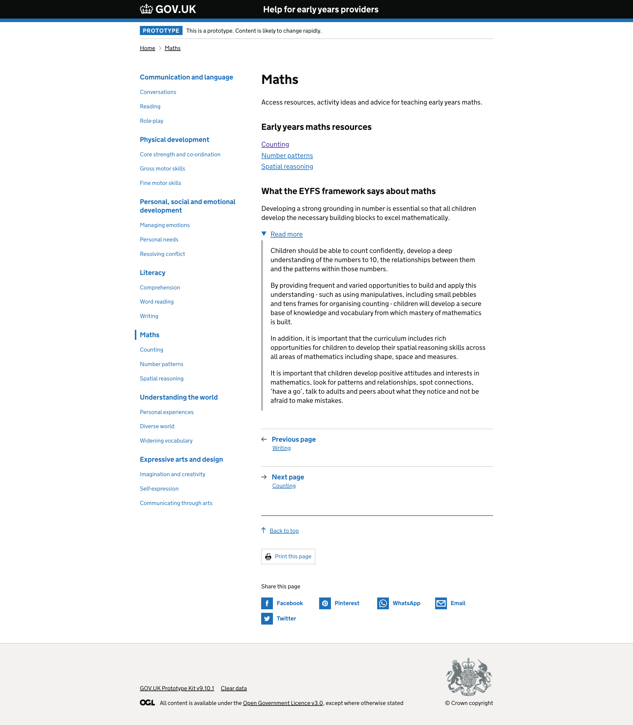
# Design decisions
-
on mobile in particular, the quote from the EYFS framework was a long and dense block of text
-
we tested showing only the first sentence, hiding the rest of the quote under a Read more link. We also put line breaks between each sentence
-
we made the Maths resources header more descriptive, to help with SEO
# User insights
- Start page content was well received and understood by the users
- Users liked the title of the page but preferred “providers” to “professionals”
- Users recognised the areas of learning after reading the card labels
- Users were able to navigate to the resources pages easily
- Users saw the breadcrumbs and used them for navigation, the iterated mobile navigation still did not provide any improvements